Takeouts on/off

Rethinking Questionnaires charting (part 1)


Rethinking Questionnaires - Live data charting

Continuing our series on Rethinking Questionnaires, this demonstration is a preliminary warm-up to support our next discussion looking at using questionnaire techniques to develop the reporting process.

We're calling it a warm-up because, although we assume that most researchers use live data reporting - that is turning survey data into a chart set for analysis and presentation straight from the data, we do know some survey packages only create tables, and others only create charts one-by-one and not slide sets. The aim of this pre-demonstration is to establish a shared perspective on current reporting methods before we look more deeply at new ideas around reporting.

Here we're using YouGov data captured before in May 2016, just before the Brexit vote, as it has to extremely interesting response data which we will focus on next time. The charts are 'live' - that is they are driven directly by survey data. That means we can set a filter and update the whole chart set, or click to see drill-down charts and do things like sort and filter the data.

Click our logo for the next slide

(Filter: males)
 

The charting process

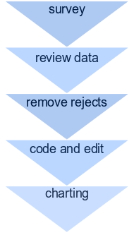
With live data charting, researchers have tools to manage respondent quality checks, data edits and open-ended coding. Charts then draw directly from original survey questions, but include summary lines, aggregated charts or other calculations, take-out text, and obviously text slides like this one.

Charting is web-based and can drive sophisticated charting tools like d3. Data can be exported to SPSS or R, and chart sets printed to .pdf or exported to Excel or Powerpoint. And tables can also be generated on the fly (see here).

As the data is live, we can add filters and have the whole dataset instantly updated. For instance, filter the data by Male or Female .

In practice, we normally present straight from the live slide set. If required the charts can be set up with a full animated Prezi style display.

Click our logo for the next slide

(Filter: males)
 

The data source

The dataset for this presentation is taken from YouGov data in connection with the UK Brexit vote. The data actually comes from May 2016 prior to the vote as part of the pre-referendum polling. 2969 respondents were interviewed across the UK by phone and online.

Opinion polling is struggling to predict the outcome of popular votes and elections, and we'll show a little more on this in the next demonstration. Here we'll show voting intention per party and for the referendum from the Yougov data, before looking at a couple of interesting questions about response rates.

The data we show are unweighted.

Click our logo for the chart on voting intention...

(Filter: males)
 

Voting intention May 2016

Base: 1444

All

Conservative
25
Labour
25
Liberal Democrat
6
UKIP
15
SNP
5
Plaid Cymru
1
Some other party
6
Would not vote
11
Don't know/refused
6
Base: 408

South

Conservative
32
Labour
18
Liberal Democrat
8
UKIP
17
SNP
0
Plaid Cymru
0
Some other party
8
Would not vote
10
Don't know/refused
7
Base: 155

London

Conservative
25
Labour
36
Liberal Democrat
3
UKIP
7
SNP
0
Plaid Cymru
1
Some other party
6
Would not vote
14
Don't know/refused
9
Base: 232

Midlands

Conservative
26
Labour
22
Liberal Democrat
5
UKIP
21
SNP
0
Plaid Cymru
0
Some other party
4
Would not vote
12
Don't know/refused
9
Base: 406

North

Conservative
24
Labour
33
Liberal Democrat
5
UKIP
14
SNP
0
Plaid Cymru
1
Some other party
6
Would not vote
10
Don't know/refused
5
Base: 125

Scotland

Conservative
16
Labour
12
Liberal Democrat
6
UKIP
2
SNP
50
Plaid Cymru
1
Some other party
6
Would not vote
6
Don't know/refused
2
Base: 118

Wales

Conservative
16
Labour
31
Liberal Democrat
7
UKIP
19
SNP
3
Plaid Cymru
3
Some other party
7
Would not vote
14
Don't know/refused
2
If there was a general election held tomorrow, which party would you vote for? Or would you not vote at all (Filter: males)
 

EU referendum preference

Base: 1444

All

Remain a member of the European Union
38
Leave the European Union
45
Undecided
14
Would not vote
3
Base: 408

South

Remain a member of the European Union
36
Leave the European Union
46
Undecided
16
Would not vote
3
Base: 155

London

Remain a member of the European Union
39
Leave the European Union
44
Undecided
10
Would not vote
6
Base: 232

Midlands

Remain a member of the European Union
32
Leave the European Union
54
Undecided
9
Would not vote
5
Base: 406

North

Remain a member of the European Union
38
Leave the European Union
45
Undecided
14
Would not vote
3
Base: 125

Scotland

Remain a member of the European Union
51
Leave the European Union
31
Undecided
16
Would not vote
2
Base: 118

Wales

Remain a member of the European Union
38
Leave the European Union
42
Undecided
16
Would not vote
3
As you may know the United Kingdom will have a referendum on its membership of the European Union on the 23rd of June this year. How will you vote on the question - Should the United Kingdom remain a member of the European Union or leave the European Union? (Filter: males)
 

State of the world

Base: 1444

All

Getting worse
58
Getting better
10
Neither
27
Don't know
5
Base: 408

South

Getting worse
60
Getting better
10
Neither
26
Don't know
4
Base: 155

London

Getting worse
51
Getting better
12
Neither
32
Don't know
5
Base: 232

Midlands

Getting worse
60
Getting better
9
Neither
25
Don't know
6
Base: 406

North

Getting worse
58
Getting better
9
Neither
28
Don't know
5
Base: 125

Scotland

Getting worse
54
Getting better
14
Neither
26
Don't know
6
Base: 118

Wales

Getting worse
67
Getting better
7
Neither
25
Don't know
2
All things considered, do you think the world is getting better or worse, or neither? (Filter: males)
 

Immigration view

Base: 1444

All

Mostly good
14
Mostly bad
42
Both good and bad
40
Don't know
4
Base: 408

South

Mostly good
14
Mostly bad
40
Both good and bad
42
Don't know
4
Base: 155

London

Mostly good
17
Mostly bad
38
Both good and bad
40
Don't know
5
Base: 232

Midlands

Mostly good
12
Mostly bad
47
Both good and bad
35
Don't know
6
Base: 406

North

Mostly good
13
Mostly bad
44
Both good and bad
39
Don't know
4
Base: 125

Scotland

Mostly good
17
Mostly bad
36
Both good and bad
46
Don't know
2
Base: 118

Wales

Mostly good
19
Mostly bad
40
Both good and bad
38
Don't know
3
And on balance, do you think the level of immigration into Britain over the last ten years has been mostly good or mostly bad for the country, or both good and bad? (Filter: males)
 

Response rates

The charts we will want to draw attention to for next time are the two following on likelihood to answer the phone and likelihood to take a call on a mobile.

In the next demonstration we'll run some calculations to show how propensity to answer can cause problems with response rates and representativeness within samples.

You might want to think about how this might affect telephone research for next time...

(Filter: males)
 

Phone answering - landline

Base: 1113

All

Always answer
23
Mostly answer
31
Mostly do not answer
19
Never answer
12
Do not have a landline telephone
14
Don't know
2
Base: 328

South

Always answer
25
Mostly answer
31
Mostly do not answer
19
Never answer
8
Do not have a landline telephone
15
Don't know
2
Base: 124

London

Always answer
24
Mostly answer
28
Mostly do not answer
16
Never answer
9
Do not have a landline telephone
19
Don't know
3
Base: 159

Midlands

Always answer
22
Mostly answer
34
Mostly do not answer
23
Never answer
6
Do not have a landline telephone
11
Don't know
4
Base: 334

North

Always answer
21
Mostly answer
28
Mostly do not answer
19
Never answer
16
Do not have a landline telephone
16
Don't know
1
Base: 94

Scotland

Always answer
27
Mostly answer
37
Mostly do not answer
11
Never answer
16
Do not have a landline telephone
10
Don't know
0
Base: 74

Wales

Always answer
20
Mostly answer
34
Mostly do not answer
19
Never answer
14
Do not have a landline telephone
12
Don't know
1
How often, if ever, do you answer phone calls to your landline telephone? Do you always answer, mostly answer, mostly do not answer, or never answer. (Filter: Contacted by mobile or online) (Filter: males)
 

Phone answering - mobile

Base: 1444

All

Always answer
11
Mostly answer
24
Mostly do not answer
26
Never answer
21
Do not have a mobile phone
4
Don't know
2
Base: 408

South

Always answer
11
Mostly answer
26
Mostly do not answer
32
Never answer
20
Do not have a mobile phone
4
Don't know
2
Base: 155

London

Always answer
18
Mostly answer
30
Mostly do not answer
23
Never answer
14
Do not have a mobile phone
4
Don't know
3
Base: 232

Midlands

Always answer
13
Mostly answer
18
Mostly do not answer
33
Never answer
25
Do not have a mobile phone
5
Don't know
2
Base: 406

North

Always answer
7
Mostly answer
22
Mostly do not answer
22
Never answer
22
Do not have a mobile phone
5
Don't know
1
Base: 125

Scotland

Always answer
9
Mostly answer
29
Mostly do not answer
26
Never answer
27
Do not have a mobile phone
2
Don't know
2
Base: 118

Wales

Always answer
19
Mostly answer
26
Mostly do not answer
16
Never answer
17
Do not have a mobile phone
0
Don't know
3
And how often, if ever, do you answer phone calls from telephone numbers you do not recognise on your mobile phone? Do you always answer, mostly answer, mostly do not answer, or never answer. (Filter: males)
 

Age and Gender

Base: 1444

All

Male 18-24
11
Male 25-49
40
Male 50-64
25
Male 65+
25
Female 18-24
0
Female 25-49
0
Female 50-64
0
Female 65+
0
Age and Gender (Filter: males)
 

Summary

This concludes our brief warm-up demonstration of live charting.

In the main Rethinking Questionnaire demonstration that will follow, we will move this much further to look at how Questionnaire techniques can be blended with charts and results and automated summaries to improve the reporting and communication process.

You can follow our full set of demonstrations on Rethinking Questionnaires at our website, or via LinkedIn .

(Filter: males)